


Todd is a Product Designer who can help you translate ambiguous user signals into design systems that are influenced by user behavior.
Based in Colorado with 5 years designing for B2B, B2C, and Agentic SaaS teams.
Details
If you’re seeking a designer who will validate direction, keep stakeholders involved, and confidently articulate complex ideas between cross-functional teams; consider adding Todd to your Product Design lineup.
My design principles are tied to actual outcomes, avoiding any assumptions built in the dark.
Truly empathetic design direction should be guided by outcomes, behavior, and metrics. From there, we can explore new hypothetical ideas further. If we hit a fork in the road, let’s pick the path which benefits the user.
Workflow
I keep stakeholders involved, we find a metric to improve, align on defining the problem, and consider any constraints we have. The first goal might be outlining ways to understand the users and their workflows. Maybe that leads to applying frameworks which explore and test a hypothesis. We’re ultimately aiming to narrow down the first useful thing we can help users with. Maybe deploy that update under a feature flag, and continue iterating from there.
Obstacles
When presented with new obstacles, I’m able to enthusiastically uncover root issues, present useful frameworks, and validate a design direction with actual facts. My philosophy is to put designs in front of users quickly, then iterate based on real behavior. Outcomes, rather than assumptions. I insist “Shipped is better than perfect”, and as a matter of fact, it’s difficult to improve a product that doesn't exist yet.
Disagreement
Product Designers are hired to say “No” without being stubborn, confrontational, or dramatic. It’s a point of view that double checks if a proposed direction will create new problems for users. My “No” argument will always be tied to relevant facts. I’ll contribute “Our metrics point to this...” or “User feedback says that...”. After all, any stakeholder can respect a disagreement which advocates for the user’s experience.
Advocacy
My argument is always tied to improving the user’s journey. My UX advocacy offers teams a perspective for “What are users saying?" and “Why are they saying it?”. A starting point which identifies where teams can immediately help users. Even if it's imperfect, those outcomes will lead to better iterations.
Recommendations
Mike Galyan, July 2025
Chief Product Officer @ TrustRadius.com
“Todd is a great designer and has pioneered some strong work around agentic experiences at TrustRadius through market research, user interviews and the Jobs-to-be-done (JTBD) framework. He has solid visual and brand design experience coupled with deep curiosity in AI and the evolution of agentic experiences. Todd is very coachable and adaptable as a designer. I enjoyed working with Todd and recommend him as a great addition to any Product/Design team!”
Case Study
A Global Filtering System for TrustRadius.com
How I uncovered hidden friction in users tasked with risky, stressful, and complicated decisions.
Designing features that restored eroding user confidence during discovery and evaluation.
Challenge
I was the Senior Product and UX Designer at TrustRadius.com. Our product was a free tool that helps users decide on the right software to run their businesses. Our users were a largely anonymous audience who frequently dropped off during their journey. Although we understood the typical user journey, we didn’t understand their reasoning. Best case, “Did they find what they needed?” or worse, “Did they give up?”.
Action
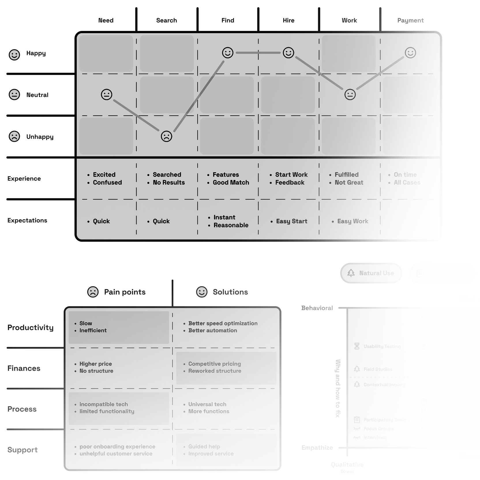
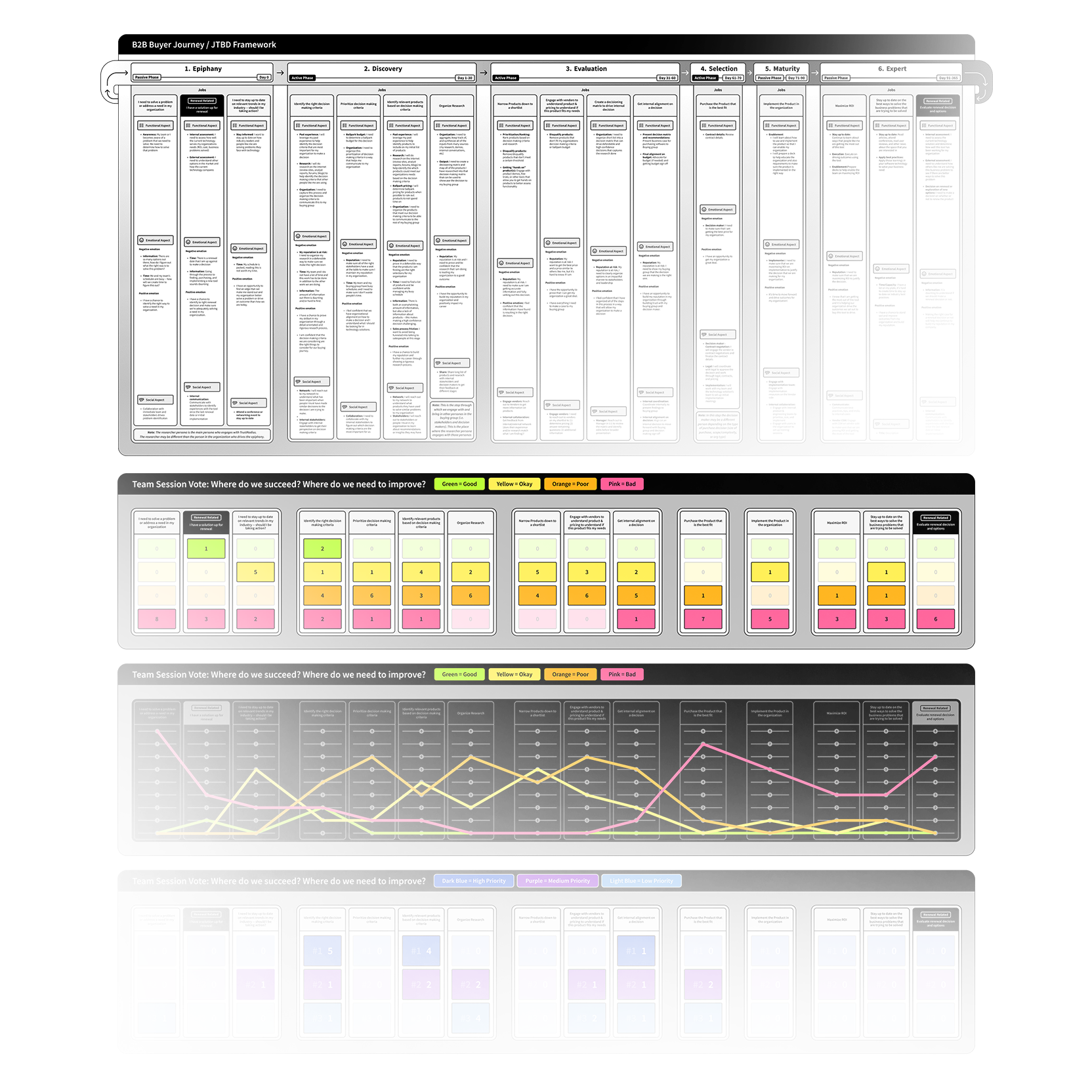
I applied a UX framework called "JTBD" or "Jobs To Be Done" which is used to help uncover customer behavior. I hosted a working session with our cross-team stakeholders, and outlined areas which might be a problem (This would be our hypothesis for where the friction might be). I planned user studies, launched surveys, then interviewed users who were carefully selected from that audience.
User Response
My study revealed that our users typically struggled during the “discovery” and “evaluation” phases of their journey. It appears their process for identifying or even understanding the actual problem takes much more behind-the-scenes effort than we expected. Here’s what my study revealed:
The discovery work is mostly self-driven, and triggered by a moment of urgency. Users rely on what they trust, they piece together information from peers, past experience, and validate everything with online research. Turns out, there’s not a lot of structured guidance early on. Users explained they would sometimes feel unsure whether they’re even looking in the right place. Ultimately, their lack of confidence slowed their momentum (sounds like a solid drop off signal right here!)
As for the evaluation stage, the pain is around the effort needed to weigh these high risk / high cost options, and stay confident in a decision. Users rely heavily on their peers and demos, but inconsistent details and “promise-the-world” marketing make it hard to separate any real options from noise. When timelines are tight, the friction here becomes increasingly amplified. Users feel forced to pick an option, even if they sense the red flags. Understandably, users shared feeling completely exposed to making a risky decision with limited clarity. What if they commit to expensive software that doesn’t work as promise? What are the business implications? What if it harms their reputation or career? Obviously, there’s a clear need in reinforcing user confidence.
Impact
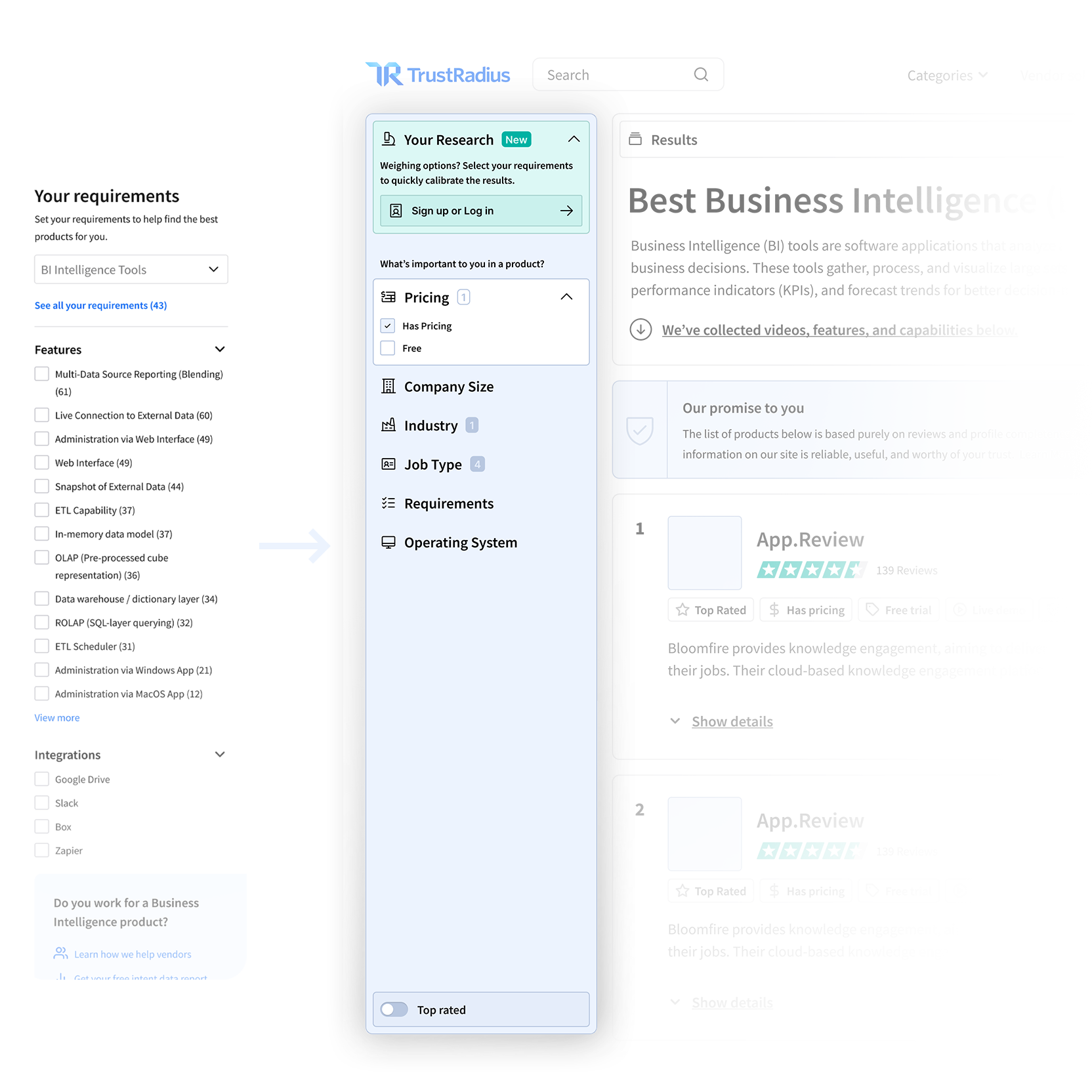
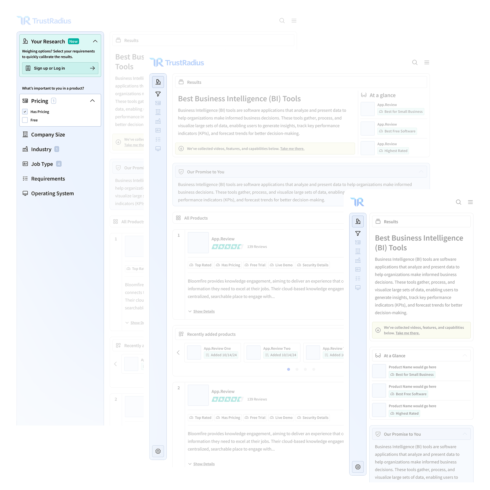
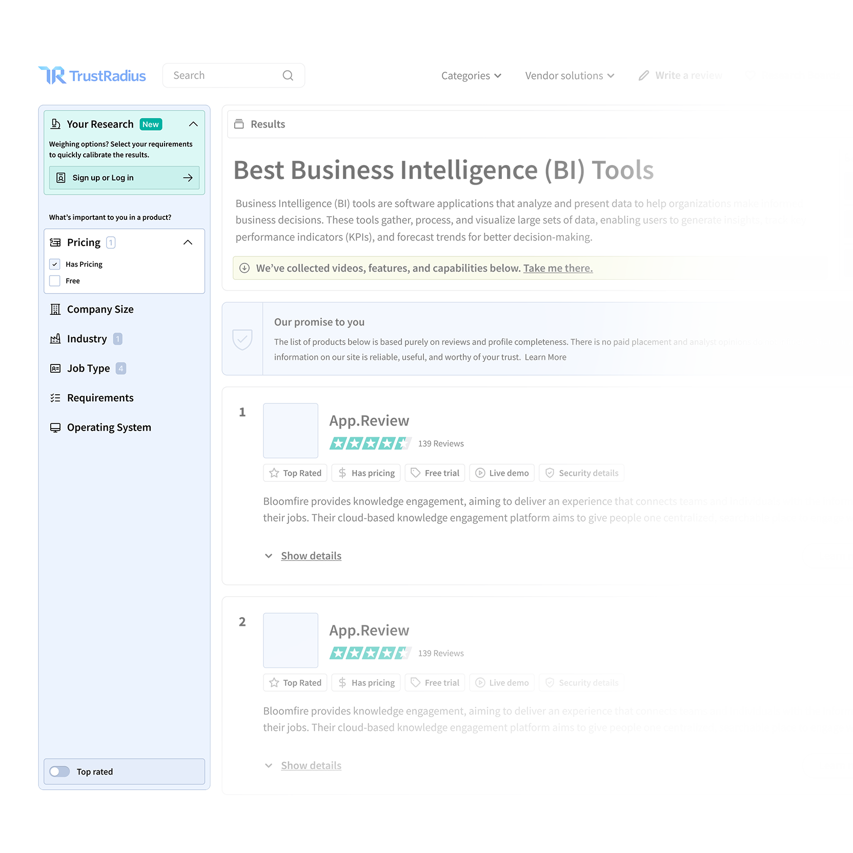
I introduced a new global filtering system, which is a fundamental update for how users navigated our website. We concluded it was the best way for anyone to navigate our massive landscape of software options. This allowed us to convert intent signals (What’s their company size? What’s their budget? What’s their feature needs?) into decisioning constraints and valuable data for intent driven leads. Irrelevant options are omitted from the results, and users could focus on software options which realistically fit their decisioning criteria. Overall, it improved genuine discoverability in general. This new system would also influence downstream AI features we had planned (detailed in my next case study). Once launched, It contributed to improved engagement, reduced evaluation friction, and established a scalable design system which could leverage upcoming AI features.
Case Study
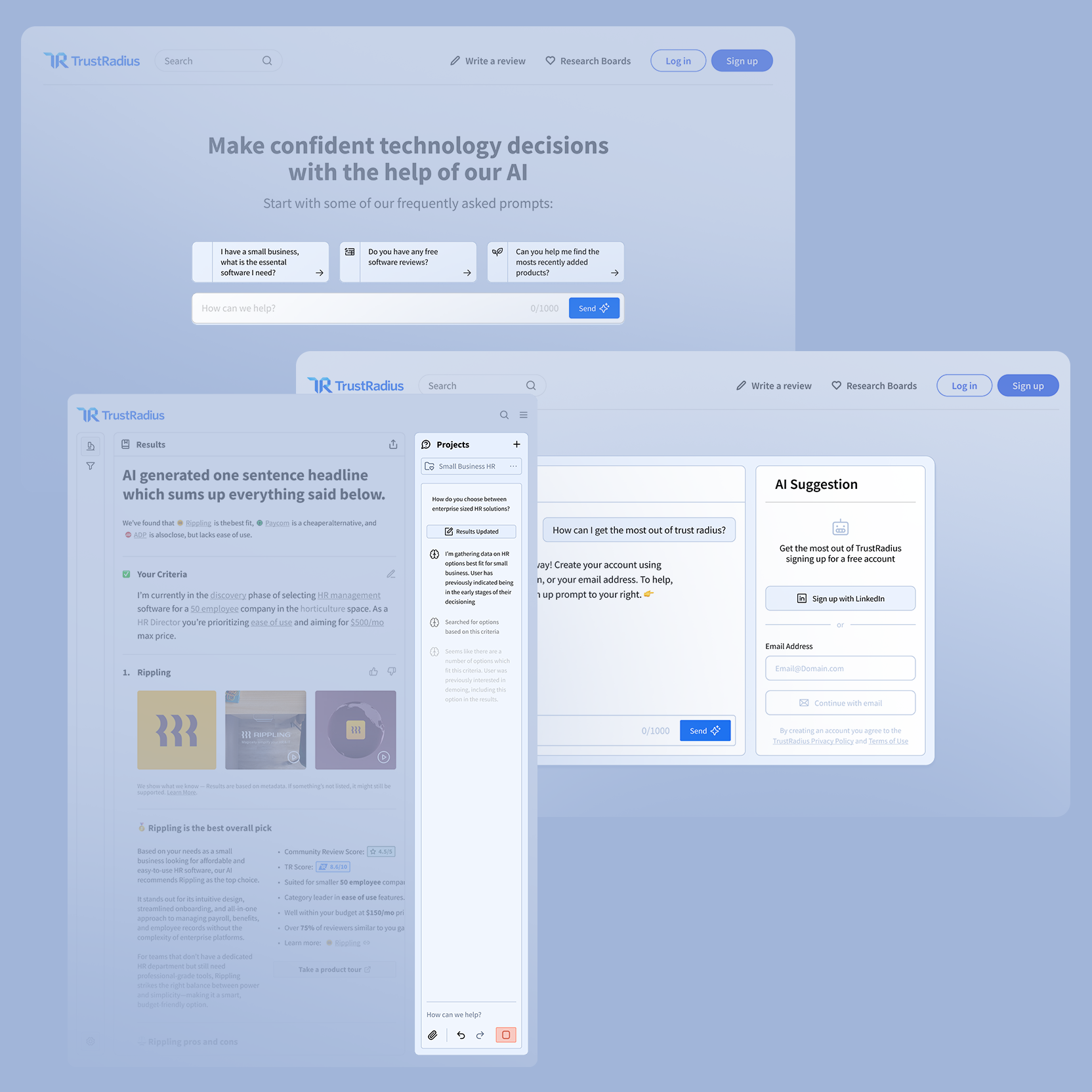
An AI Decisioning Assistant for TrustRadius.com
Pioneering agentic experiences and simplifying 110,000 review pages into an easier user journey.
Protecting our really great proprietary content from scraping, and simplifying the experience into a single search bar.
Challenge
I led the design of an AI copilot feature that was intended to simplify around 110,000 pages of software details into a simple tailored experience. At the time, Google’s AI-aided search changes posed a serious risk to our business model. Our proprietary reviews and comparisons could be summarized or scraped elsewhere, threatening the value of our accumulated long-form research. Our users trusted us for high-stakes and high-cost decisions (Choosing the right software for Payroll, HR, etc). An area where maintaining confidence tends to be critical. We needed a solution that protected our content from scraping, improved user decisioning confidence, and as a bonus, created opportunities for premium access for our particularly valuable data (for instance, what’s the real street price for enterprise software that typically requires a meeting?).
Action
As the Senior Product and UX Designer, I was already leading user surveys and interviews to uncover friction in discovery and evaluation. In fact, without being prompted, several users even suggested an AI assistant as a way to feel more confident navigating options. I partnered closely with our Principle Engineer during a hackathon to explore feasibility. I worked alongside my PM and under the guidance of our CPO and CTO. Together, we defined what we called “AIX”, or “AI Experience” which was a way of considering how an AI agent should behave, guide user, and build trust in their decisioning. Ultimately during our sprints, leadership made a hard call: Due to internal security concerns. We pivoted to avoid an open chat MVP and instead designed a structured, “choose-your-own-adventure” or “smart journey” model driven by the new global filtering system I recently designed.
User Response
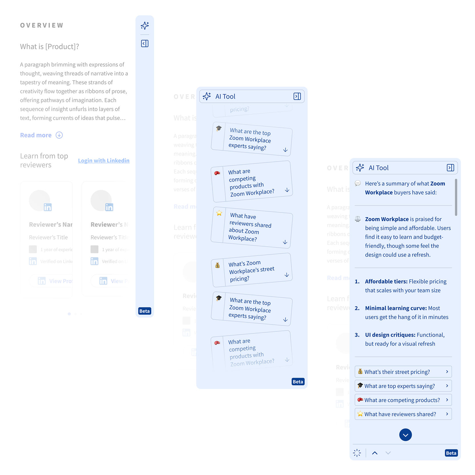
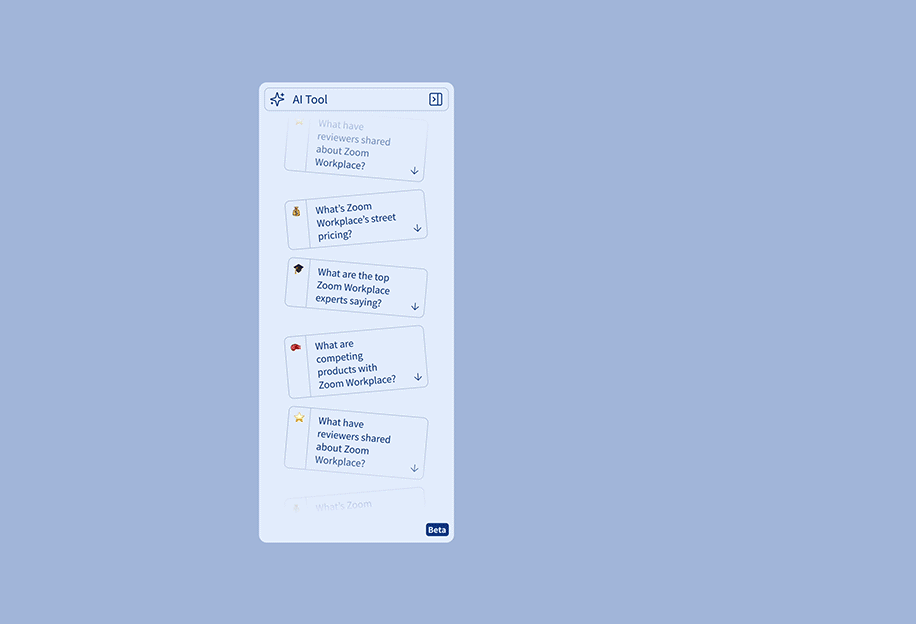
Rather than typing free-form prompts, users were presented with tailored AI-guided journeys such as “What’s the essential software starter pack for a small business?” or “How do you choose between enterprise HR solutions?”. These journeys were live, dynamic, and instantaneously reflected what each added to their filters and shortlist selections. This approach would reduce cognitive load, help users frame their problem earlier, and maintain trust by helping them connect their research on personalized recommendations rather than the alternative: “making a risky guess”. Early feedback showed users moved through discovery and evaluation with more momentum and less drop-off.
Impact
The AI copilot was able to transform filtered data into actionable guidance. This allowed users to move from weighing vague shortlist options, to confidently making informed decisions. The AI features would dynamically analyze reviews, software tradeoffs, and weigh the user’s criteria with rich contextual data. This helped users understand why certain tools actually fit their needs rather than simply sending back more information to digest. The guided interaction model could maintain the user’s confidence while leading them closer to evaluation. That’s the goal, afterall. This feature ultimately reduced drop off during stressful moments in the journey, and became one of the platform’s most engaged-with experiences, driving significant traffic growth and led to acquisition of the business.
Design Systems and Visual Range
Rather than approaching visual design as a fixed personal style, I approach it as a decision point. While planning design systems, I consider the context of user needs and product constraints. Sometimes a product requires an existing system, and sometimes it needs to be custom tailored to fit.

Google’s Material Design System
Apple’s Liquid Glass Design System
Monday’s Vibe Design System
Todd’s Custom Rounded Design System
IBM’s Carbon Design System
Assorted Product Design Work
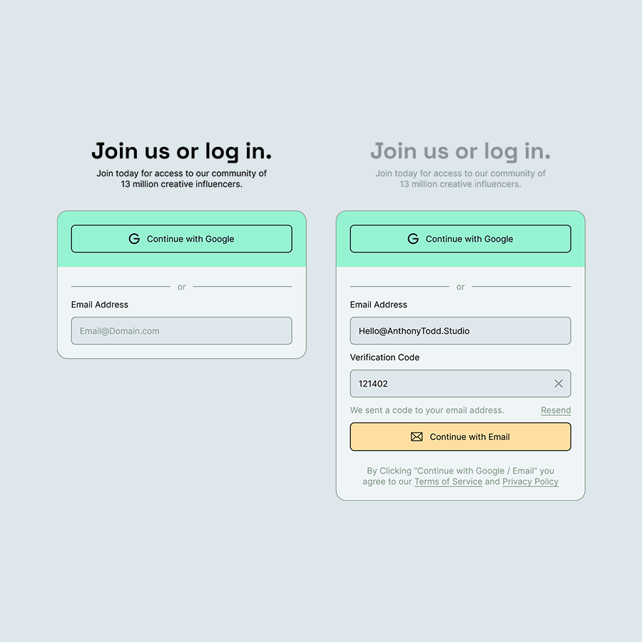
Login flow that expands to reveal a 2FA verification layer.
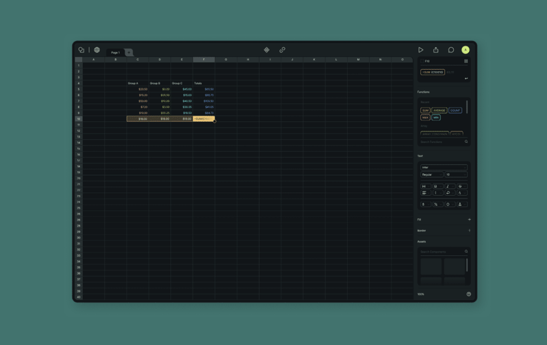
Interface for a spreadsheet platform which uses component-based formulas.
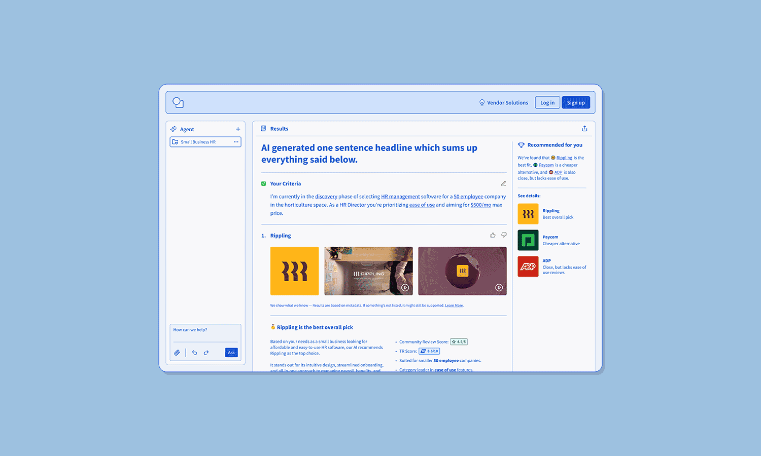
A modernized review platform guided by an AI assistant.
Interactive and collapsable sidebar flows.
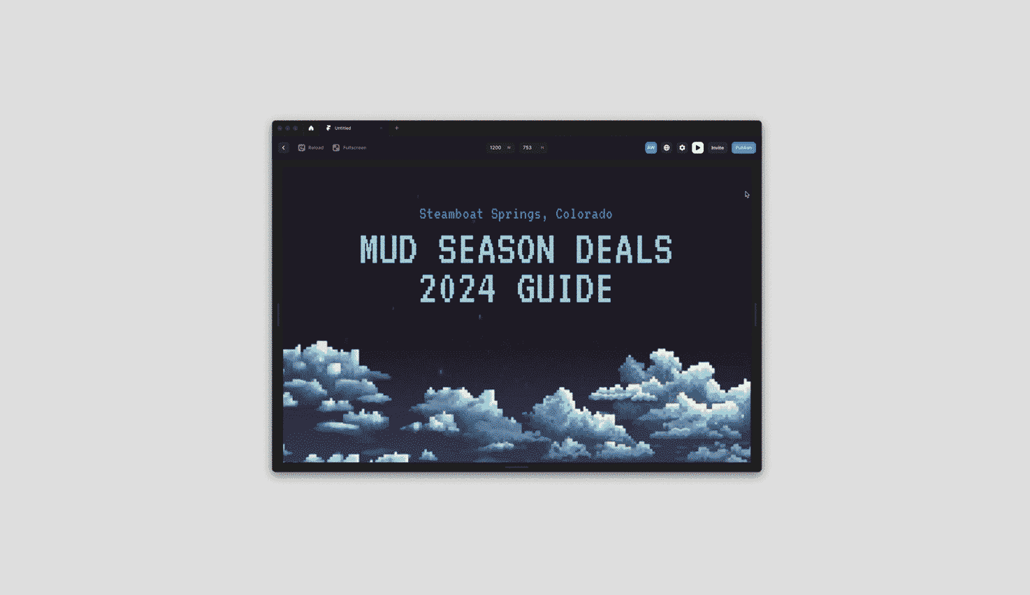
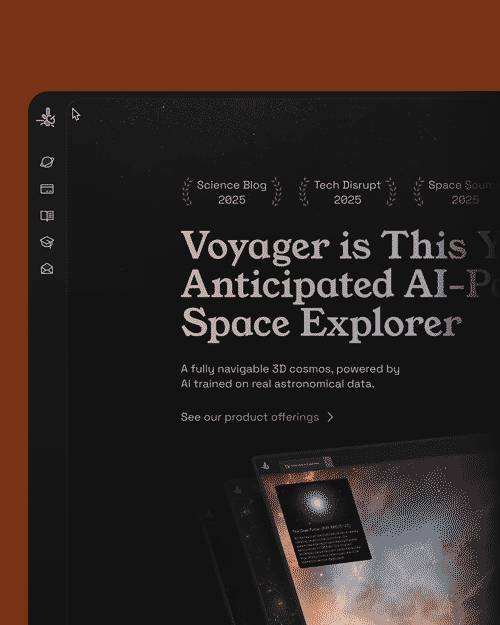
Custom parallax landing page.
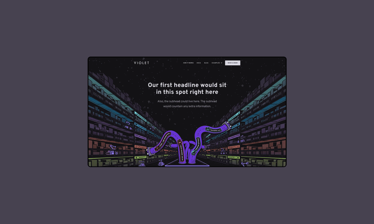
Custom parallax marketing website.

Todd is a Product Designer who can help you translate ambiguous user signals into design systems that are influenced by user behavior.
Based in Colorado with 5 years designing for B2B, B2C, and Agentic SaaS teams.
Details
If you’re seeking a designer who will validate direction, keep stakeholders involved, and confidently articulate complex ideas between cross-functional teams; consider adding Todd to your Product Design lineup.
My design principles are tied to actual outcomes, avoiding any assumptions built in the dark.
Truly empathetic design direction should be guided by outcomes, behavior, and metrics. From there, we can explore new hypothetical ideas further. If we hit a fork in the road, let’s pick the path which benefits the user.
Workflow
I keep stakeholders involved, we find a metric to improve, align on defining the problem, and consider any constraints we have. The first goal might be outlining ways to understand the users and their workflows. Maybe that leads to applying frameworks which explore and test a hypothesis. We’re ultimately aiming to narrow down the first useful thing we can help users with. Maybe deploy that update under a feature flag, and continue iterating from there.
Obstacles
When presented with new obstacles, I’m able to enthusiastically uncover root issues, present useful frameworks, and validate a design direction with actual facts. My philosophy is to put designs in front of users quickly, then iterate based on real behavior. Outcomes, rather than assumptions. I insist “Shipped is better than perfect”, and as a matter of fact, it’s difficult to improve a product that doesn't exist yet.
Disagreement
Product Designers are hired to say “No” without being stubborn, confrontational, or dramatic. It’s a point of view that double checks if a proposed direction will create new problems for users. My “No” argument will always be tied to relevant facts. I’ll contribute “Our metrics point to this...” or “User feedback says that...”. After all, any stakeholder can respect a disagreement which advocates for the user’s experience.
Advocacy
My argument is always tied to improving the user’s journey. My UX advocacy offers teams a perspective for “What are users saying?" and “Why are they saying it?”. A starting point which identifies where teams can immediately help users. Even if it's imperfect, those outcomes will lead to better iterations.
Recommendations
Mike Galyan, July 2025
Chief Product Officer @ TrustRadius.com
“Todd is a great designer and has pioneered some strong work around agentic experiences at TrustRadius through market research, user interviews and the Jobs-to-be-done (JTBD) framework. He has solid visual and brand design experience coupled with deep curiosity in AI and the evolution of agentic experiences. Todd is very coachable and adaptable as a designer. I enjoyed working with Todd and recommend him as a great addition to any Product/Design team!”
Case Study
A Global Filtering System for TrustRadius.com
How I uncovered hidden friction in users tasked with risky, stressful, and complicated decisions.
Designing features that restored eroding user confidence during discovery and evaluation.
Challenge
I was the Senior Product and UX Designer at TrustRadius.com. Our product was a free tool that helps users decide on the right software to run their businesses. Our users were a largely anonymous audience who frequently dropped off during their journey. Although we understood the typical user journey, we didn’t understand their reasoning. Best case, “Did they find what they needed?” or worse, “Did they give up?”.
Actions
I applied a UX framework called "JTBD" or "Jobs To Be Done" which is used to help uncover customer behavior. I hosted a working session with our cross-team stakeholders, and outlined areas which might be a problem (This would be our hypothesis for where the friction might be). I planned user studies, launched surveys, then interviewed users who were carefully selected from that audience.
User Response
My study revealed that our users typically struggled during the “discovery” and “evaluation” phases of their journey. It appears their process for identifying or even understanding the actual problem takes much more behind-the-scenes effort than we expected. Here’s what my study revealed:
The discovery work is mostly self-driven, and triggered by a moment of urgency. Users rely on what they trust, they piece together information from peers, past experience, and validate everything with online research. Turns out, there’s not a lot of structured guidance early on. Users explained they would sometimes feel unsure whether they’re even looking in the right place. Ultimately, their lack of confidence slowed their momentum (sounds like a solid drop off signal right here!)
As for the evaluation stage, the pain is around the effort needed to weigh these high risk / high cost options, and stay confident in a decision. Users rely heavily on their peers and demos, but inconsistent details and “promise-the-world” marketing make it hard to separate any real options from noise. When timelines are tight, the friction here becomes increasingly amplified. Users feel forced to pick an option, even if they sense the red flags. Understandably, users felt completely exposed to making a risky decision with limited clarity. What if they commit to expensive software that doesn’t work as promised? What are the business implications? What if it harms their reputation or career? Obviously, there’s a clear need in reinforcing user confidence.
Impact
I introduced a new global filtering system, which is a fundamental update for how users navigated our website. We concluded it was the best way for anyone to navigate our massive landscape of software options. This allowed us to convert intent signals (What’s their company size? What’s their budget? What’s their feature needs?) into decisioning constraints and valuable data for intent driven leads. Irrelevant options are omitted from the results, and users could focus on software options which realistically fit their decisioning criteria. Overall, it improved genuine discoverability in general. This new system would also influence downstream AI features we had planned (detailed in my next case study). Once launched, It contributed to improved engagement, reduced evaluation friction, and established a scalable design system which could leverage upcoming AI features.
Case Study
An AI Decisioning Assistant for TrustRadius.com
Pioneering agentic experiences and simplifying 110,000 review pages into an easier user journey.
Protecting our really great proprietary content from scraping, and simplifying the experience into a single search bar.
Challenge
I led the design of an AI copilot feature that was intended to simplify around 110,000 pages of software details into a simple tailored experience. At the time, Google’s AI-aided search changes posed a serious risk to our business model. Our proprietary reviews and comparisons could be summarized or scraped elsewhere, threatening the value of our accumulated long-form research. Our users trusted us for high-stakes and high-cost decisions (Choosing the right software for Payroll, HR, etc). An area where maintaining confidence tends to be critical. We needed a solution that protected our content from scraping, improved user decisioning confidence, and as a bonus, created opportunities for premium access for our particularly valuable data (for instance, what’s the real street price for enterprise software that typically requires a meeting?).
Actions
As the Senior Product and UX Designer, I was already leading user surveys and interviews to uncover friction in discovery and evaluation. In fact, without being prompted, several users even suggested an AI assistant as a way to feel more confident navigating options. I partnered closely with our Principle Engineer during a hackathon to explore feasibility. I worked alongside my PM and under the guidance of our CPO and CTO. Together, we defined what we called “AIX”, or “AI Experience” which was a way of considering how an AI agent should behave, guide user, and build trust in their decisioning. Ultimately during our sprints, leadership made a hard call: Due to internal security concerns. We pivoted to avoid an open chat MVP and instead designed a structured, “choose-your-own-adventure” or “smart journey” model driven by the new global filtering system I recently designed.
User Response
Rather than typing free-form prompts, users were presented with tailored AI-guided journeys such as “What’s the essential software starter pack for a small business?” or “How do you choose between enterprise HR solutions?”. These journeys were live, dynamic, and instantaneously reflected what each added to their filters and shortlist selections. This approach would reduce cognitive load, help users frame their problem earlier, and maintain trust by helping them connect their research on personalized recommendations rather than the alternative: “making a risky guess”. Early feedback showed users moved through discovery and evaluation with more momentum and less drop-off.
Impact
The AI copilot was able to transform filtered data into actionable guidance. This allowed users to move from weighing vague shortlist options, to confidently making informed decisions. The AI features would dynamically analyze reviews, software tradeoffs, and weigh the user’s criteria with rich contextual data. This helped users understand why certain tools actually fit their needs rather than simply sending back more information to digest. The guided interaction model could maintain the user’s confidence while leading them closer to evaluation. That’s the goal, afterall. This feature ultimately reduced drop off during stressful moments in the journey, and became one of the platform’s most engaged-with experiences, driving significant traffic growth and led to acquisition of the business.
Design Systems and Visual Range
Rather than approaching visual design as a fixed personal style, I approach it as a decision point. While planning design systems, I consider the context of user needs and product constraints. Sometimes a product requires an existing system, and sometimes it needs to be custom tailored to fit.
Google’s Material Design System
Apple’s Liquid Glass Design System
Monday’s Vibe Design System
Todd’s Custom Rounded Design System
IBM’s Carbon Design System
Assorted Product Design Work
Login flow that expands to reveal a 2FA verification layer.
Interface for a spreadsheet platform which uses component-based formulas.
A modernized review platform guided by an AI assistant.
Interactive and collapsable sidebar flows.
Custom parallax landing page.
Custom parallax marketing website.
Todd is a Product Designer who can help you translate ambiguous user signals into design systems that are influenced by user behavior.
Based in Colorado with 5 years designing for B2B, B2C, and Agentic SaaS teams.
Details
If you’re seeking a designer who will validate direction, keep stakeholders involved, and confidently articulate complex ideas between cross-functional teams; consider adding Todd to your Product Design lineup.
My design principles are tied to actual outcomes, avoiding any assumptions built in the dark.
Truly empathetic design direction should be guided by outcomes, behavior, and metrics. From there, we can explore new hypothetical ideas further. If we hit a fork in the road, let’s pick the path which benefits the user.
Workflow
I keep stakeholders involved, we find a metric to improve, align on defining the problem, and consider any constraints we have. The first goal might be outlining ways to understand the users and their workflows. Maybe that leads to applying frameworks which explore and test a hypothesis. We’re ultimately aiming to narrow down the first useful thing we can help users with. Maybe deploy that update under a feature flag, and continue iterating from there.
Obstacles
When presented with new obstacles, I’m able to enthusiastically uncover root issues, present useful frameworks, and validate a design direction with actual facts. My philosophy is to put designs in front of users quickly, then iterate based on real behavior. Outcomes, rather than assumptions. I insist “Shipped is better than perfect”, and as a matter of fact, it’s difficult to improve a product that doesn't exist yet.
Disagreement
Product Designers are hired to say “No” without being stubborn, confrontational, or dramatic. It’s a point of view that double checks if a proposed direction will create new problems for users. My “No” argument will always be tied to relevant facts. I’ll contribute “Our metrics point to this...” or “User feedback says that...”. After all, any stakeholder can respect a disagreement which advocates for the user’s experience.
Advocacy
My argument is always tied to improving the user’s journey. My UX advocacy offers teams a perspective for “What are users saying?" and “Why are they saying it?”. A starting point which identifies where teams can immediately help users. Even if it's imperfect, those outcomes will lead to better iterations.
Recommendations
Mike Galyan, July 2025
Chief Product Officer @ TrustRadius.com
“Todd is a great designer and has pioneered some strong work around agentic experiences at TrustRadius through market research, user interviews and the Jobs-to-be-done (JTBD) framework. He has solid visual and brand design experience coupled with deep curiosity in AI and the evolution of agentic experiences. Todd is very coachable and adaptable as a designer. I enjoyed working with Todd and recommend him as a great addition to any Product/Design team!”
Case Study
A Global Filtering System for TrustRadius.com
How I uncovered hidden friction in users tasked with risky, stressful, and complicated decisions.
Designing features that restored eroding user confidence during discovery and evaluation.
Challenge
I was the Senior Product and UX Designer at TrustRadius.com. Our product was a free tool that helps users decide on the right software to run their businesses. Our users were a largely anonymous audience who frequently dropped off during their journey. Although we understood the typical user journey, we didn’t understand their reasoning. Best case, “Did they find what they needed?” or worse, “Did they give up?”.
Actions
I applied a UX framework called "JTBD" or "Jobs To Be Done" which is used to help uncover customer behavior. I hosted a working session with our cross-team stakeholders, and outlined areas which might be a problem (This would be our hypothesis for where the friction might be). I planned user studies, launched surveys, then interviewed users who were carefully selected from that audience.
User Response
My study revealed that our users typically struggled during the “discovery” and “evaluation” phases of their journey. It appears their process for identifying or even understanding the actual problem takes much more behind-the-scenes effort than we expected. Here’s what my study revealed:
The discovery work is mostly self-driven, and triggered by a moment of urgency. Users rely on what they trust, they piece together information from peers, past experience, and validate everything with online research. Turns out, there’s not a lot of structured guidance early on. Users explained they would sometimes feel unsure whether they’re even looking in the right place. Ultimately, their lack of confidence slowed their momentum (sounds like a solid drop off signal right here!)
As for the evaluation stage, the pain is around the effort needed to weigh these high risk / high cost options, and stay confident in a decision. Users rely heavily on their peers and demos, but inconsistent details and “promise-the-world” marketing make it hard to separate any real options from noise. When timelines are tight, the friction here becomes increasingly amplified. Users feel forced to pick an option, even if they sense the red flags. Understandably, users felt completely exposed to making a risky decision with limited clarity. What if they commit to expensive software that doesn’t work as promised? What are the business implications? What if it harms their reputation or career? Obviously, there’s a clear need in reinforcing user confidence.
Impact
I introduced a new global filtering system, which is a fundamental update for how users navigated our website. We concluded it was the best way for anyone to navigate our massive landscape of software options. This allowed us to convert intent signals (What’s their company size? What’s their budget? What’s their feature needs?) into decisioning constraints and valuable data for intent driven leads. Irrelevant options are omitted from the results, and users could focus on software options which realistically fit their decisioning criteria. Overall, it improved genuine discoverability in general. This new system would also influence downstream AI features we had planned (detailed in my next case study). Once launched, It contributed to improved engagement, reduced evaluation friction, and established a scalable design system which could leverage upcoming AI features.
Case Study
An AI Decisioning Assistant for TrustRadius.com
Pioneering agentic experiences and simplifying 110,000 review pages into an easier user journey.
Protecting our really great proprietary content from scraping, and simplifying the experience into a single search bar.
Challenge
I led the design of an AI copilot feature that was intended to simplify around 110,000 pages of software details into a simple tailored experience. At the time, Google’s AI-aided search changes posed a serious risk to our business model. Our proprietary reviews and comparisons could be summarized or scraped elsewhere, threatening the value of our accumulated long-form research. Our users trusted us for high-stakes and high-cost decisions (Choosing the right software for Payroll, HR, etc). An area where maintaining confidence tends to be critical. We needed a solution that protected our content from scraping, improved user decisioning confidence, and as a bonus, created opportunities for premium access for our particularly valuable data (for instance, what’s the real street price for enterprise software that typically requires a meeting?).
Actions
As the Senior Product and UX Designer, I was already leading user surveys and interviews to uncover friction in discovery and evaluation. In fact, without being prompted, several users even suggested an AI assistant as a way to feel more confident navigating options. I partnered closely with our Principle Engineer during a hackathon to explore feasibility. I worked alongside my PM and under the guidance of our CPO and CTO. Together, we defined what we called “AIX”, or “AI Experience” which was a way of considering how an AI agent should behave, guide user, and build trust in their decisioning. Ultimately during our sprints, leadership made a hard call: Due to internal security concerns. We pivoted to avoid an open chat MVP and instead designed a structured, “choose-your-own-adventure” or “smart journey” model driven by the new global filtering system I recently designed.
User Response
Rather than typing free-form prompts, users were presented with tailored AI-guided journeys such as “What’s the essential software starter pack for a small business?” or “How do you choose between enterprise HR solutions?”. These journeys were live, dynamic, and instantaneously reflected what each added to their filters and shortlist selections. This approach would reduce cognitive load, help users frame their problem earlier, and maintain trust by helping them connect their research on personalized recommendations rather than the alternative: “making a risky guess”. Early feedback showed users moved through discovery and evaluation with more momentum and less drop-off.
Impact
The AI copilot was able to transform filtered data into actionable guidance. This allowed users to move from weighing vague shortlist options, to confidently making informed decisions. The AI features would dynamically analyze reviews, software tradeoffs, and weigh the user’s criteria with rich contextual data. This helped users understand why certain tools actually fit their needs rather than simply sending back more information to digest. The guided interaction model could maintain the user’s confidence while leading them closer to evaluation. That’s the goal, afterall. This feature ultimately reduced drop off during stressful moments in the journey, and became one of the platform’s most engaged-with experiences, driving significant traffic growth and led to acquisition of the business.
Design Systems and Visual Range
Rather than approaching visual design as a fixed personal style, I approach it as a decision point. While planning design systems, I consider the context of user needs and product constraints. Sometimes a product requires an existing UI Kit, and sometimes it needs to be custom tailored to fit.
Google’s Material
Design System
Apple’s Liquid Glass Design System
Monday’s Vibe
Design System
Todd’s Custom Rounded Design System
IBM’s Carbon
Design System
Login flow that expands to reveal a 2FA verification layer.
Assorted Product Design Work
Interface for a spreadsheet platform which uses component-based formulas
A modernized review platform guided by an AI assistant
Interactive and collapsable sidebar flows.
Custom parallax landing page.
Custom parallax marketing website.